Adaptive Web Design Vs Responsive Web Design
Posted on Sunday, April 13, 2014
The web development community is buzzing with two new terms, Adaptive web design and responsive web design. Now the interesting thing about this buzz is that it’s become a bit vague as to the difference between the two terms. Some have been very vocal about the distinct differences and others are saying there is really not enough of a difference to clearly make a solid description.
This is so new to the world of web design that even Wikipedia has little clear information and is openly asking for help to improve the topic. What they do say about the subject is this.
“Adaptive web design is basically the same as responsive design and shares many of the same ideals and goals. The main difference however is that the changes are made on the server side rather than the client side.
Adaptive websites are designed to respond and adapt to different screen sizes using responsive techniques, and to adapt to different User requirements based on different device capabilities.
The responsive design aspect of adaptive design involves the implementation of various design factors such as flexible layouts, CSS file alternatives and flexible images, which are activated using media queries.
Adaptive web design also encompasses a range of other strategies which, when combined with responsive design techniques, enables you to deliver the best possible User experience to the widest possible audience. This means that numerous functionalities and environmental factors can be catered for in the most User friendly way, depending on the particular device being used to access your website.”
That being said, let’s talk real world and why a site owner would benefit from these two types of web design.
If you were to ask most developers about “Adaptive” design you would hear deep breathes and maybe even some not so polite comments. I’m safe in saying that everyone that codes or develops websites feels the same way about Internet Explorer. Even IE themselves has poked fun of how bad their browser “sucks” as the video in this post will show you.
Browser experience impacts your visitors, if your website has issues with certain features and those features are rendered funky, off center or even missing on the browser that’s being used by your visitor it could mean they never visit again. This type of Adaptive development really should be a part of your new website design in as much as any developer would know better than to launch a site before checking how the end products views and performs on IE, Chrome and Firefox.
So let’s focus on the really fun stuff for your website – Responsive Web Design.
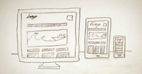
For anyone not living on a different planet it’s clear that the way users access the internet and most importantly YOUR website is vastly different now then let’s say 10 years ago. No longer are users sitting in front of a desk top or lap top to interact online. We are now accessing the net via iPads, phones and other portable devices that offer an endless amount of screen sizes.
If your website design is created to best be viewed and navigated on a desktop screen but loses much of the flow, features and user experience, if for example, a potential customer is browsing your site on their phone or iPad device then you have probably not impressed that user too much and it may just be the reason you didn’t make a sale or earn a new loyal customer.
Let’s face it; in this or any economy, we work too hard to bring visitors to our businesses and our websites. Losing even one potential client/customer because our website didn’t respond well to their search device is simply not acceptable.
So what does this all mean to all those great sites that were developed before the rush of all these different screen sized, mobile devices? Well……….. That’s not such an easy answer. Depending on the platform that the site was built on you may be able to simply change the theme of the site and go on with your day. If the platform is not able to be re-themed for Responsive features, you’re looking at a re design of your website.
I hear the groans from here…….. No one said keeping up with technology would be easy and 10 years ago we would have never been able to anticipate just where and how users would be accessing information online.
The question you will have to ask yourself is ‘What are my competitors going to do?” Playing king of hill means you always have someone nipping at your heels to take your crown. It seems a bit ridiculous to hand it to them just because they took advantage of the technology.
Do you want to know more? Do you need more answers then this article gave you? Call our office today and speak directly to one of our developers, let them take at look at your website and make some recommendations. There’s no cost for call but lack of information could cost you big dollars in lost revenue and search engine ranking.
Call Complete Web Solutions, we’re located in Las Vegas, NV the number is 719 302-5029.
Your customers are searching online right now. Are they finding your or your competitors?